Through the early weeks of the project, Tech Fleet Researchers learned about The Serious Type and our
anticipated target audience, Gen Z. Learnings from academic research pointed our work towards testable
assumptions.
Methods: Survey, User Interviews, Academic Research, Competitive Analysis
What we learned: Device addiction and unrealistic expectations have major
negative impact on mental
health. Our work needed to include positive, productive, healthy interactions as core design principles.
How I helped
Survey Design and Distribution: I provided feedback to apprentices to help
craft effective survey
questions. I then helped to distribute the survey and analyze results.
KEY SURVEY RESULTS
64%
Have taken a break from social media
72%
Use social media to learn a new skill
88%
Use social media “almost constantly” or “several times per day”
92%
Say device addiction is the most negative aspect of social media
102 RESPONDENTS
User Interviews: I helped the research team craft the first User Interview
plan.
I then synthesized data from 5 User Interviews to develop team-wide insights. We saw an interesting
combination of user goals that aligned with TST’s goals: exploring and learning new skills.
5 of 6
use social media for learning or professional skills development
5 of 6
use social media in a “mindless” way in the absence of a goal
4 of 6
worry about the way they think others view them online
Conclusions: The survey and interview results were compelling and remarkably
consistent. Users liked
social media for staying in touch and learning new things. They were aware they tended to spend too much
time on social media, but took breaks when they felt they needed to.
I was personally surprised by how many people use social media to learn new skills ranging from hobbies
to professional skills. The principle gain for users came from the intentional use of social media,
rather than the infinte, mindless scroll most social media apps rely on.
Survey and interview insights also started a team discussion around another desired outcome of our work:
positive impacts on mental health.
We observed a recurring theme around users’ activity on social media impacting their mental health. This
was
further supported by our academic research data, and was roughly consistent across ages.
This consistency spurred the Product Strategy team to see an opportunity to serve more users by providing
positive social media experiences for people of all ages. We imagined a community of users and mentors
making positive, creative contributions with positive impacts on the mental health of both groups.
What we learned: Through the sprint, the team gained alignment on possible
opportunities. We also learned
how
other apps solved similar problems.
Why we did this: I love using this framework because it promotes identifying
ideas that might work and
getting teams aligned quickly to create testable artifacts.
How I helped
Design Sprint Facillitation: I planned, facilitated and led the Design
Sprint
activities, schedule, and
conversations.
OUR DESIGN PROCESS
Understand
Brainstorm
Imagine
Map
Understand
Affinity Map Conclusions: Our Affinity Map from last week provided a number of
insights we could
incorporate into our designs:
Goals
Learning
Keeping in touch
Career progression
Staying updated on events
Exploring specific interests
Pain Points
Insecurity
Distraction
Addiction
Fear of missing out
Privacy
Brainstorm
How Might We... (HMW): Armed with the knowledge of what users were trying to
accomplish, we jotted down
some challenges to think about in the form of How Might We... questions.
I then asked the team to group similar HMWs together and make any changes needed to create a
team-approved version representing each category. I chose to do this to be certain the team knew the
exact problems we were attemping to solve.
Prioritize: The Product Strategy team prioritized six HMWs to focus on for
this Sprint.
Imagine
Sketch: There were 12 team members at this meeting. Everyone selected 2 HMWs
for a Crazy 8’s
sketching
session. For each HMW question, we:
- Sketched 8 ideas in 8 minutes
- Picked our favorite 3 sketches
- Created 8 more sketches in 8 more minutes
Even primitive, rough sketches provided a wealth of opportunities to pursue. For example, these two
sketches of mine were eventually incorporated into the user profile:
Dot Voting: We voted asynchronously to select our favorite sketches from the
145 options. An
interesting
combination of features emerged:
Dedicated topic areas that users can follow and post into
Connecting our research with opportunities
For interactive learning, mentoring, or just hanging out
Personality and Privacy, together
Setting the tone for experience as a whole
Allow users to highlight content they want feedback on
Map
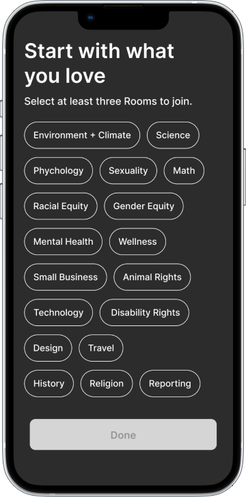
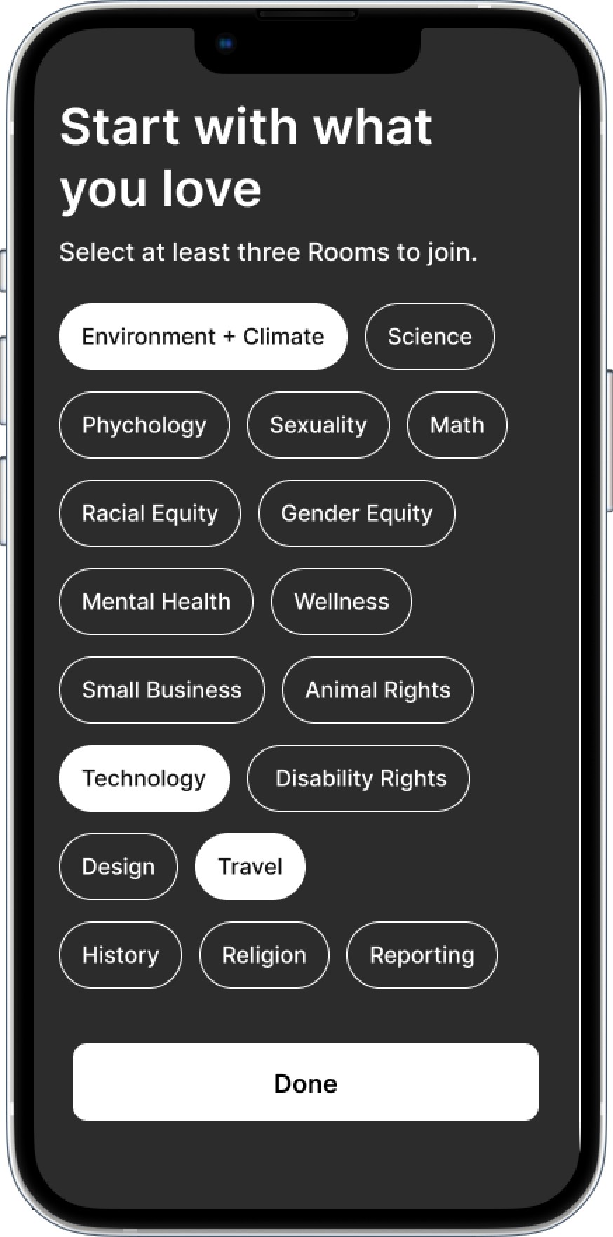
MVP: The Product team defined an MVP based on our Research. Users need a
profile, Live Sessions
Pages, a
way to connect with mentors, and a way to create posts.
Rough Flows: I led a discussion to create very simple user flows to get us
started. These flows
provided
the foundation of our design work as we began to understand how the pieces might fit together.
We noted steps to the flow, charted our assumptions, and jotted down questions where we were
uncertain.
Concept Definition
Low, Mid & High Fidelity
2 Rounds of Usability Tests
10 Test Participants
We had begun to circle around a concept: Users can join Rooms, attend Sessions, and create and consume
posts
by peers or Mentors in their Rooms. Mentors can provide feedback on a user’s work in Sessions with other
users or schedule one-on-one meetups to give feedback privately.
Why we did this: We believed this combination of features would allow users a
creative space focused on
learning and improvement.
How I helped: As design lead, my primary focus was ensuring each voice was
heard. This led to fruitful
discussions and a concept none of us had thought of on our own.
Low Fidelity
Key Screens and Testing Insights
Observations
Users were able to figure out our unconventional home screen, but swiping in two directions was
too
much.
We observed just enough hesitation to make us reconsider this approach.
The biggest challenge users faced was finding the Create button. The white-on-white unlabeled
button
was
confusing.
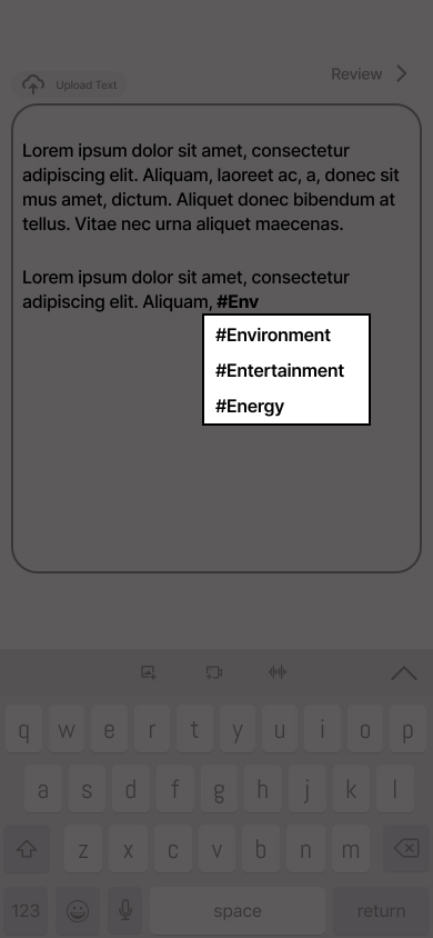
Users were also not totally clear on how hashtags impacted their posts.
Users had confusion about what Sessions were and why they would want to join one
We iterated our home screen and flows based on data from usability tests. We also created first
iterations for other key MVP features: a profile page, a messaging feature, and a discover page.
I asked each team member to bring ideas for new home screen concepts. We spent synchronous time talking
over our designs and bringing in the best elements from each team member. I also asked the team to begin
thinking about visual design as well.
Why we did this: Our project timeline required us to end with a High Fidelity
MVP in 8 weeks. With only 2
weeks left, we needed to make rapid progress on both fidelity and features.
Set-up
User Flows: I updated our flows to reflect the detail we had added since
brainstorming features.
Research Analysis: I participated in a team-wide analysis of the first round of
Usability Tests. We used
observations to drive actionable insights into mid-fidelity.
Updates
Data from usability tests guided updates to key screens from low fidelity:
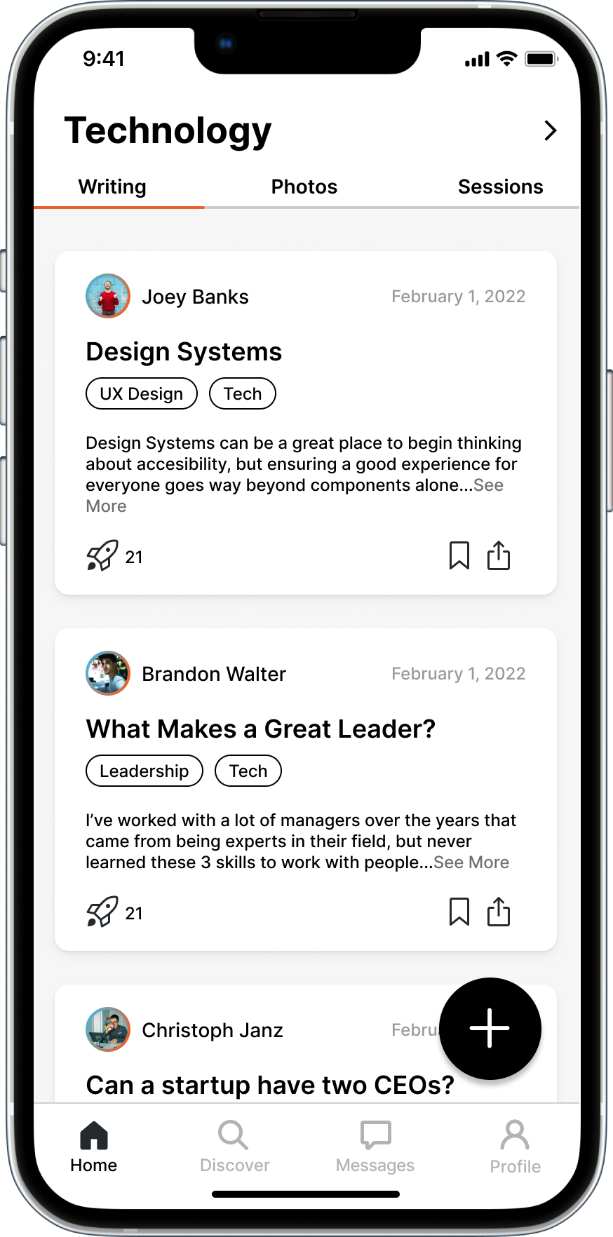
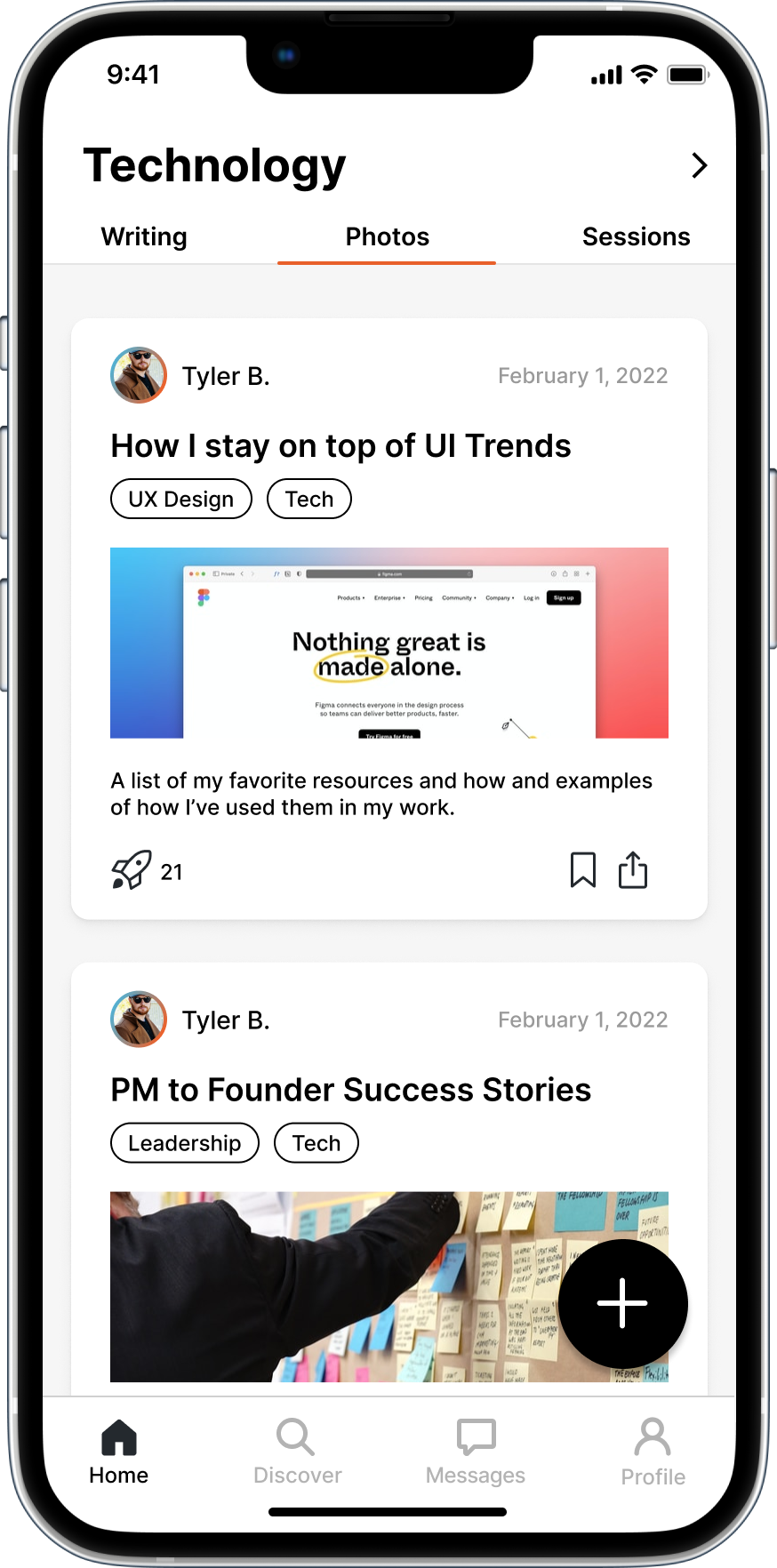
Home
More Intuitive: We updated the swiping interaction to simple tabs to
access
different content.
Create Button: We brought the create button out of the Nav, made it
significantly larger and more accessible
in black and white.
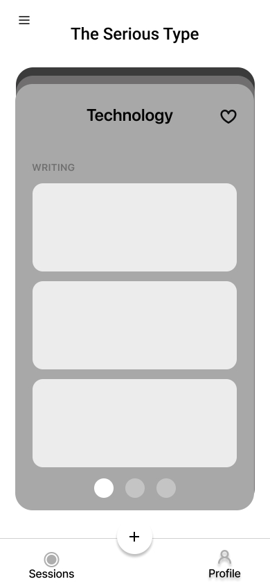
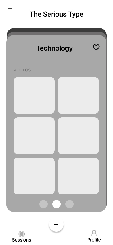
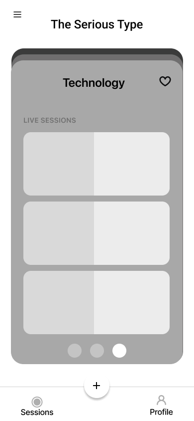
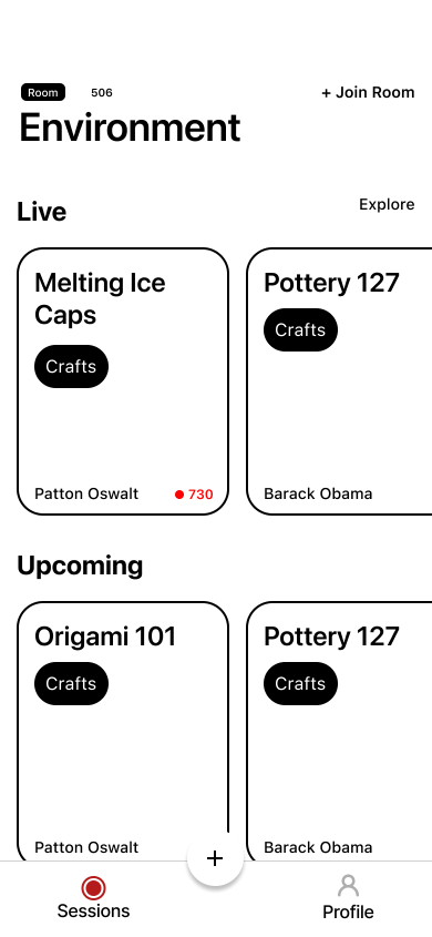
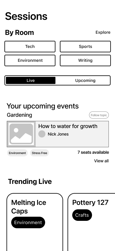
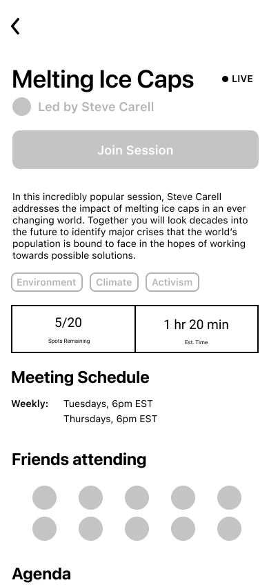
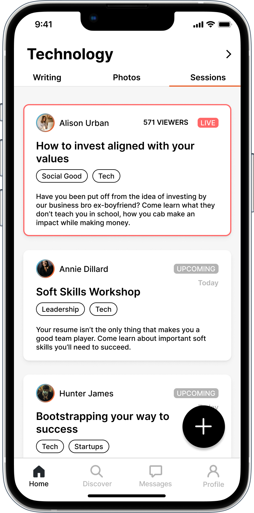
Rooms
Live Sessions, Explained: We decided to feature one live session and
one upcoming session with enough information for
users to understand what to expect if they join.
Tags
Clearer Purpose: Users can now see the rooms they follow as possible
places to post. We believed this would
eliminate hesitancy around hashtags as personal advertisements.
New Features
To make our MVP goal, we needed a user profile, a way to get in touch with mentors, and a discover
feature
User Profile

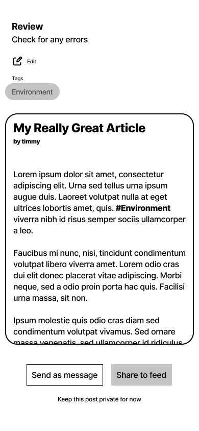
Profiles show users' Rooms to encourage interaction and exploration.
Users have a calendar that shows their upcoming Live Sessions.
Users can pin a post to seek feedback.
Private Sharing

Some users were hesitant to post publicly for fear of being
judged.
We gave users the option to share work privately.
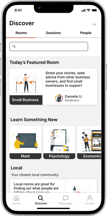
Discover

In order to get away from an endless home scroll, we needed some kind of discovery feature.
The Serious Type’s existing web page provided a basic structure we could follow for now.
Getting in touch with a Mentor
Users can send their work privately to mentors as well as other users.
I added an option to send a post privately in a message and book time with a mentor directly
in the message
The mentorship session is saved to the private calendar on both the user and mentor’s
profiles
Mid-Fi Usability Tests
The Research team conducted 4 Usability Tests
Insight 1: Removing in-line hashtags in the Create a Post flow was a step
forward.
Insight 2: Users would like a way to vet a potential mentor.
Insight 3: Users liked being able to book a time with a mentor directly in the
messaging feature, but the
calendar needed to be refined (it was from a UI kit to save time).
Next Steps
Phase 1 of this project ended with an agreement that Tech Fleet would continue with a second Phase of
work for The Serious Type. To set ourselves up for success, we compiled a set of recomnmendations:
- Conduct Usability Tests
Test our high fidelity prototype with users of The Serious
Type to understand how our current solution addresses their needs.
- Learn More about Deceptive Patterns
We need to
understand how current social platforms hook users to design with mental health and avoiding Dark
Pattern.
- Explore Mentorship Service Design
The early research of this project led us to belive that mentorship could be a game changer when it
comes to social media.
We need a better understanding of how we should include mentorship in the app.