KINFOLK Dispensary
Responsive Web Redesign and Front End Development

Team
3 Designers
Timeline
2 Weeks
Tools
Figma, Miro, VS Code, GitHub
My Role
US Research, UX Design, UI Design, FE Dev
Timeline
Week 1
UX Research
Definition
Information Architecture
Week 2
Sketching / Wireframing
Mid Fi / Testing
Hi Fi Prototyping
Front End Development
Brief
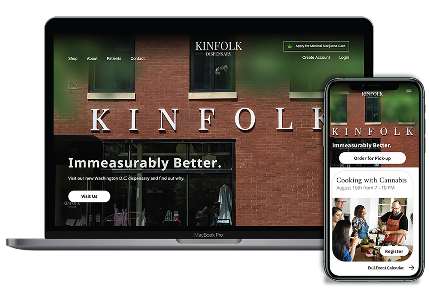
KINFOLK is a medical marijuana dispensary that seeks to make its clients and its community Immeasurably Better. While rebranding, they moved their shop to a new neighborhood and needed to connect with local clientele. This homepage redesign delivered a new brand aesthetic and improved usability.

The Problem
KINFOLK’s new location is suffering reduced foot traffic as a result of their move and the covid pandemic. The existing website lacks effective calls to action bringing users to the store. It’s no wonder that clients aren’t coming in.

The Challenge
We had to use existing branding to redesign the homepage with a predefined goal of enticing customers into the store’s new location in a new neighborhood and take it to a coded prototype — in just 2 weeks.

The Solution
A sophisticated and modern website that features clear information architecture, exudes brand personality, and highlights the in-store experience.
I. Research
Stakeholder Interview

Name Change
Formerly Metropolitan Wellness Center, the brand is focused on appearing less clinical. The new name, KINFOLK, is intended to create a sense of community and hospitality.

New Location
The business couldn't rely on clients from the old location to meet their needs. Stakeholders identified an opportunity to target new customers in the new neighborhood.

New Website
Our design efforts had to fit within a rebranding framework that was already underway. The current website doesn’t drive foot traffic to the physical store. We had to change that.
Survey & Usability Tests
We conducted a survey and 5 usability tests of the existing website. Users had a neutral to semi-positive outlook on medical marijuana in general, and an overwhelmingly positive view on its effects as a treatment option.
Their main concerns were:
- Knowing what strain is right in their given circumstance,
- Learning how to get a medical marijuana card,
- And the text-heavy experience.
Q: If you were prescribed medical marijuana by a doctor tomorrow, what questions would you want answered by your dispensary?
A: “ I would want them to know which strains would specifically help me with whatever condition I have.”
A: “ What strains provide what effects”
A: “How will certain strains support or hinder my medical goals”
II. Definition
User Persona
Allison DeLaurens
Age: 29
Location: Washington, D.C., NOMA neighborhood
Status: Single
Personality: Social, charismatic, sensitive, needs alone time
Bio
Allison is a high-achieving recruiter who struggles with chronic pain, migraines, and some insomnia. She currently works as a recruiter in Washington D.C. Her symptoms affect her personal life keeping her from going out and socializing.
She’s been looking for alternatives to treat her chronic pain, like actively exercising and improving her nutrition to compensate for her hectic lifestyle. She's looking to find and connect with a community that understands her struggles and shares similar worldview and lifestyles.
Goals
- To make new friends with similar interests
- To get mental health in a stable place
- To invest in her personal care
- To have a greater sense of community
Motivations
- To find holistic ways to manage her chronic pain
- Feels lonely & wants to get her social life back
- To become more knowledgeable about Cannabis in general
Pain Points
- Chronic physical pain
- Unfamiliar with strain types and their effects
- Overwhelmed by text heavy websites
- Doesn't know how to get medical marijuana card
- Marijuana seems taboo
User Story
Our Persona, Allison, is an archetype of the neighborhood and reflects data gathered in our research. She’s a high achieving, driven recruiter and always busy. She’s experimented with marijuana in college, but never really thought of it as medicine. A friend who is a KINFOLK client recommends the brand.
She visits the website with a little trepidation and logs off without taking action. One day her friend insists that she go to the store, where she sees the beautifully designed space, interacts with personable, professional experts, and decides to let the brand try to help her.
III. Ideation
Sketches
Low fi sketches helped us decide on a layout. The three sketches below are among the ones I contributed to the project. While the third sketch became the starting point for our designs, we continued to iterate together. We scaled back some of our ideas for feasibility given the timline.

v1: Too simple

v2: Too confusing

v3: Goldilocks
Mid Fidelity and Testing
Usability Test Feedback
Login and Signup should be closer to eachother as they are related elements.
Users were pleased, but not quite delighted by this hero image I snapped on my phone. It gave a good idea of the direction we were going, but we needed a higher quality image.
We assumed going into the test that the Get a Medical Marijuana Card component would need to change. Again, users were pleased but not delighted.
It wasn’t obvious to users what we were trying to communicate with the icons in the What Strain is Right for You section.


IV. Execution

The familiar facade of the building reinforces the local aspect of the business to Allison, who sees this image in her daily life.

Events align with what she’s looking for: a sense of community and to get her social life up and running.

Even though Allison isn’t familiar with the process of getting a Medical Marijuana Card, this three-step process doensn’t look too hard

The gallery, photographed by a fellow designer, displays images of the store, products, and staff. Allison doesn’t need to wonder what’s behind the frosted glass doors anymore.

Now that Allison is more comfortable with the process the location, and the staff, she can read brief descriptions of how different strains can help her.

The spotlight on senior leadership reinforces KINFOLK’s commitment to the responsible, legal, and holistic use of Medical Marijuana.

A final CTA paired with a map encourages Allison to visit the store to learn more.

In the Footer, Allison finds social media links and is able to continue to engage with the brand as she considers beginning a relationship with KINFOLK.
Next Steps
KINFOLK’s commitment to social justice and equity, their advocacy for safe, legal and holistic use of Cannabis products, and their role as a community thought leader are very inspiring. KINFOLK is not just a point-of-sale, it’s local leader, and that sets them apart from the competition.
We want to incorporate this aspect of the brand into the website as we continue to tell their story.
Future iterations will require building out secondary pages, obviously. We will likely want to add a quick shop feature to the home page, but will verify that through testing and user interviews.
Lastly, expected legislative changes will legalize recreational marijuana in Washington, D.C. within a year or so. KINFOLK’S new website positions them not only as a medical marijuana dispensary, but as a lifestyle brand for holistic health. We'll pursue this angle when the time comes and keep making its customers and community Immeasurably Better.


