GoCreate

Enterprise App
GoCreate Hero Image
My Role

UX Research, UX Design, UI Design

Timeline

3 weeks

Tools

Miro, AdobeXD, Adobe Illustrator
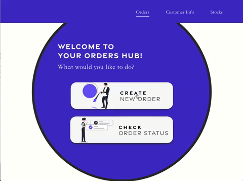
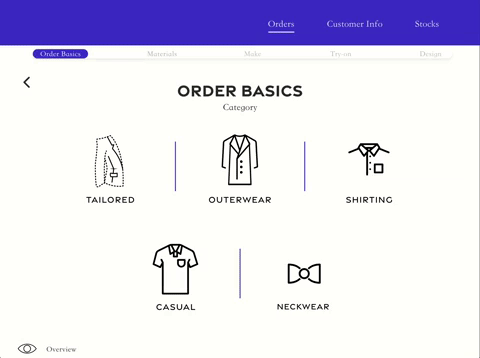
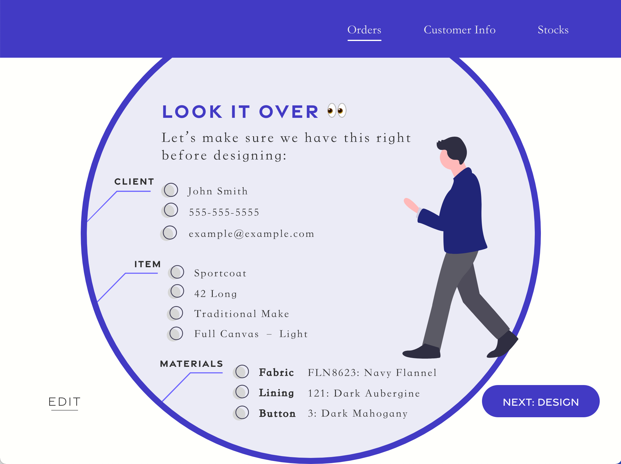
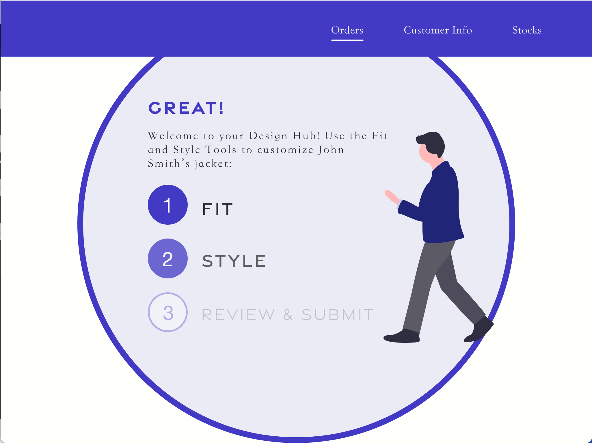
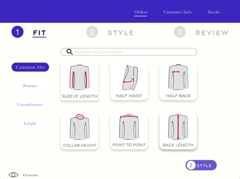
What is this?

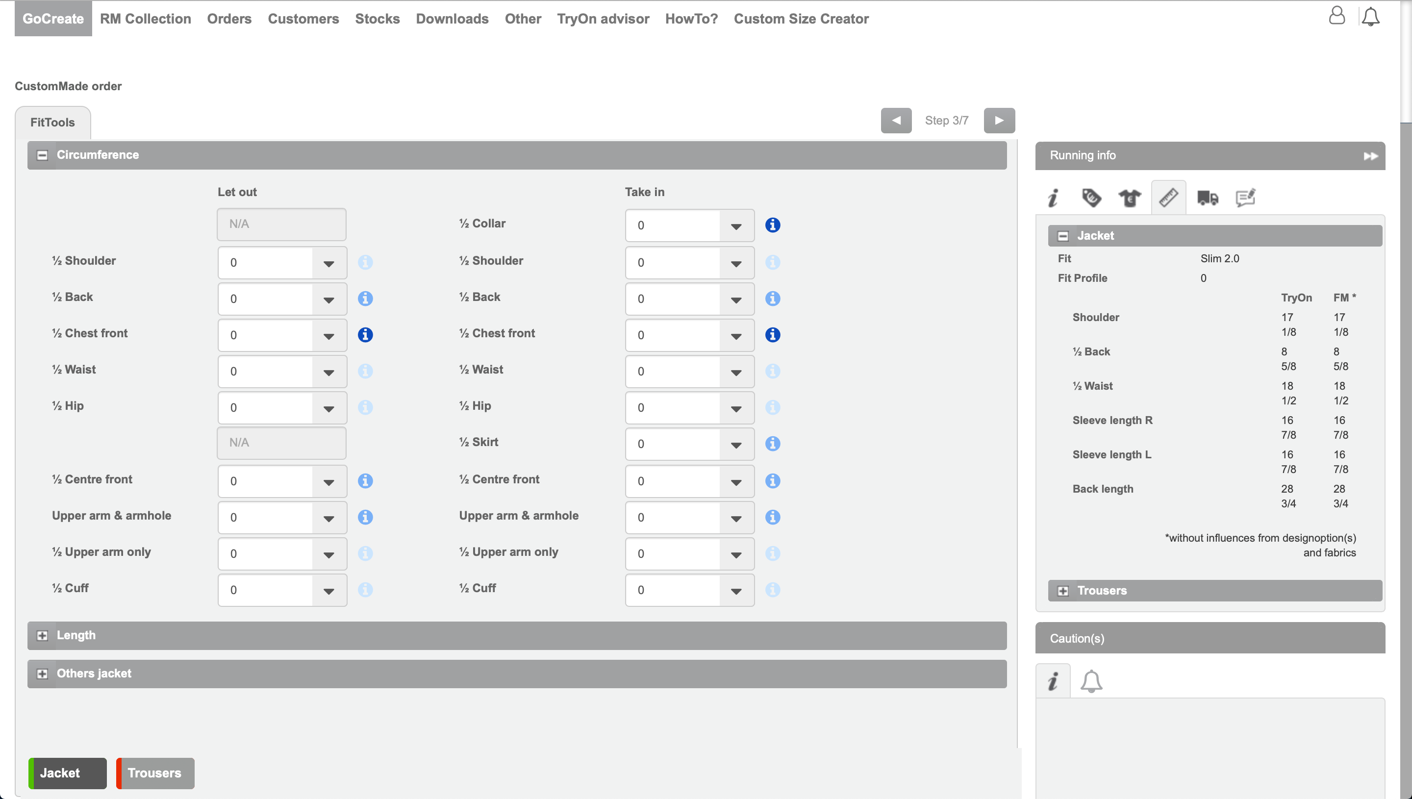
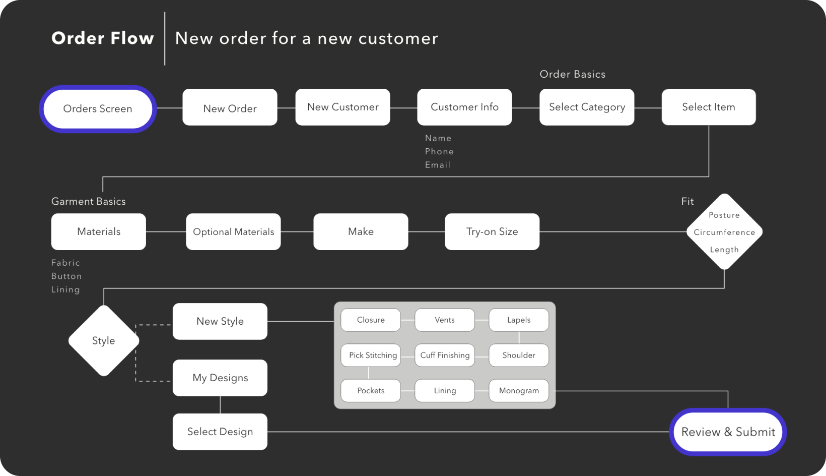
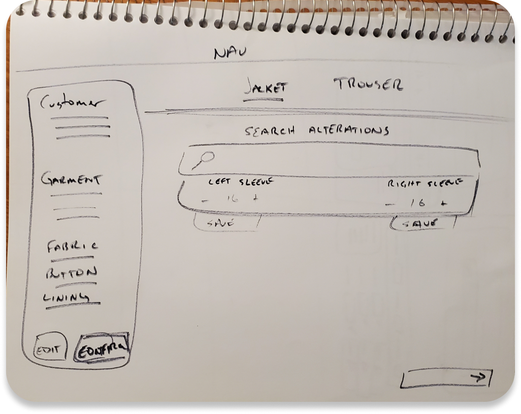
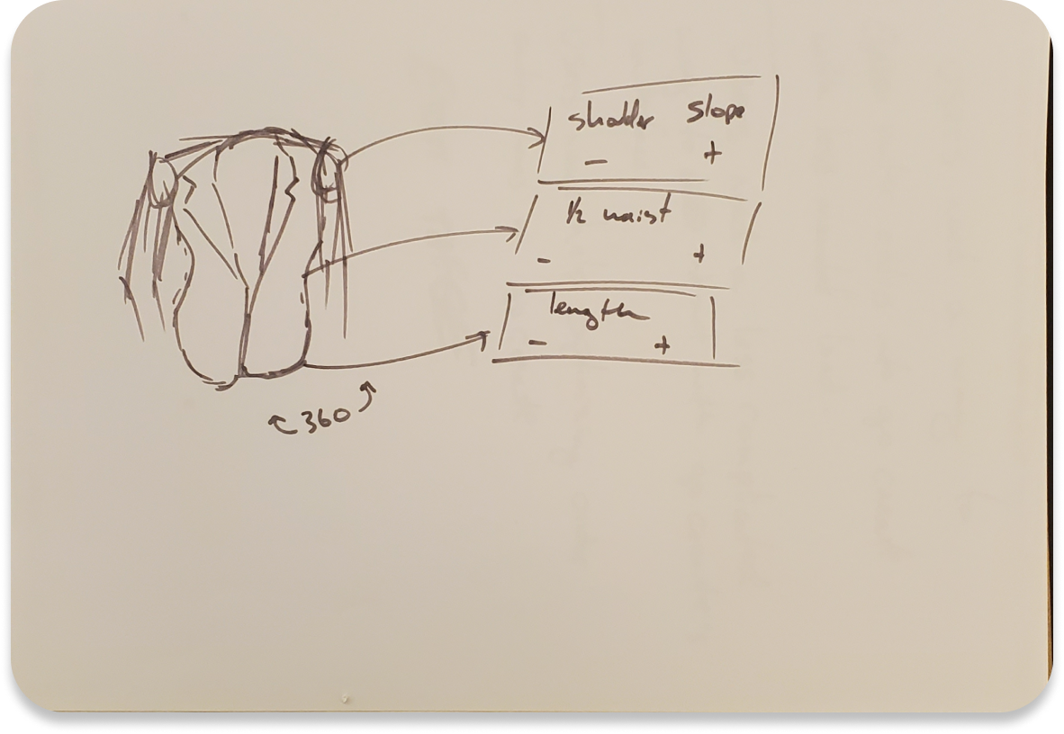
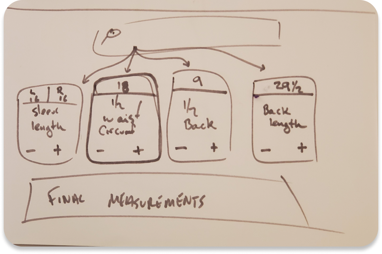
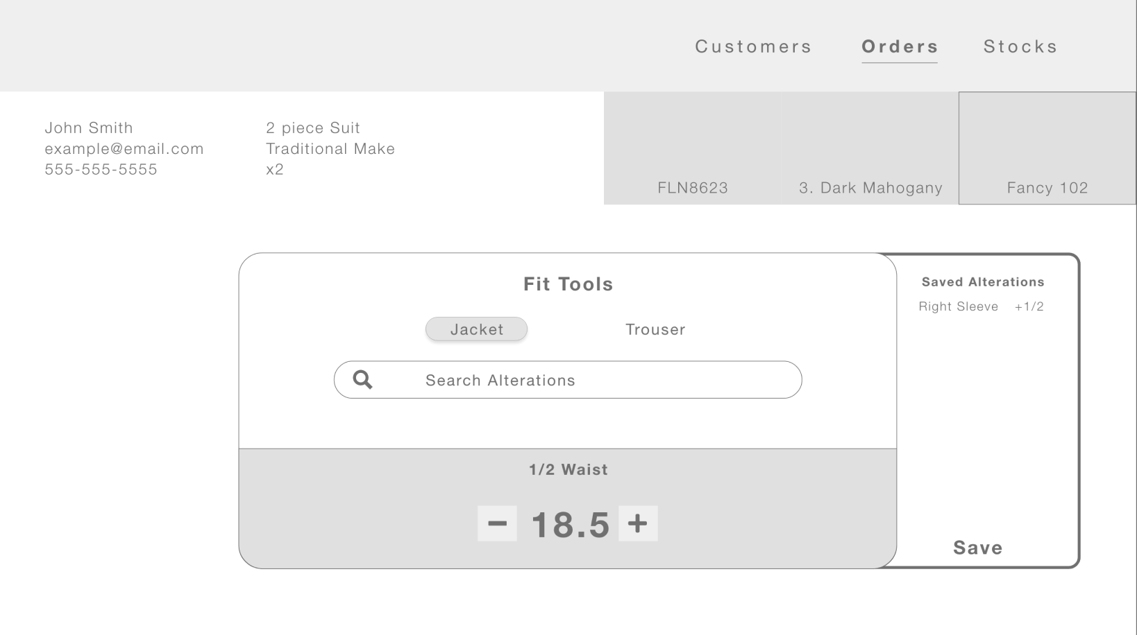
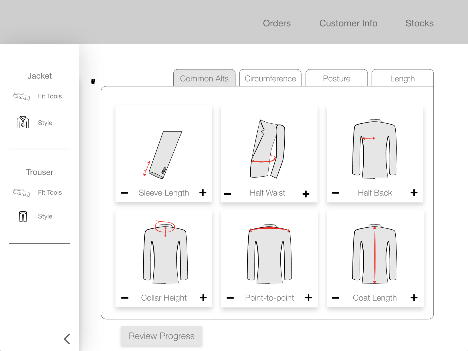
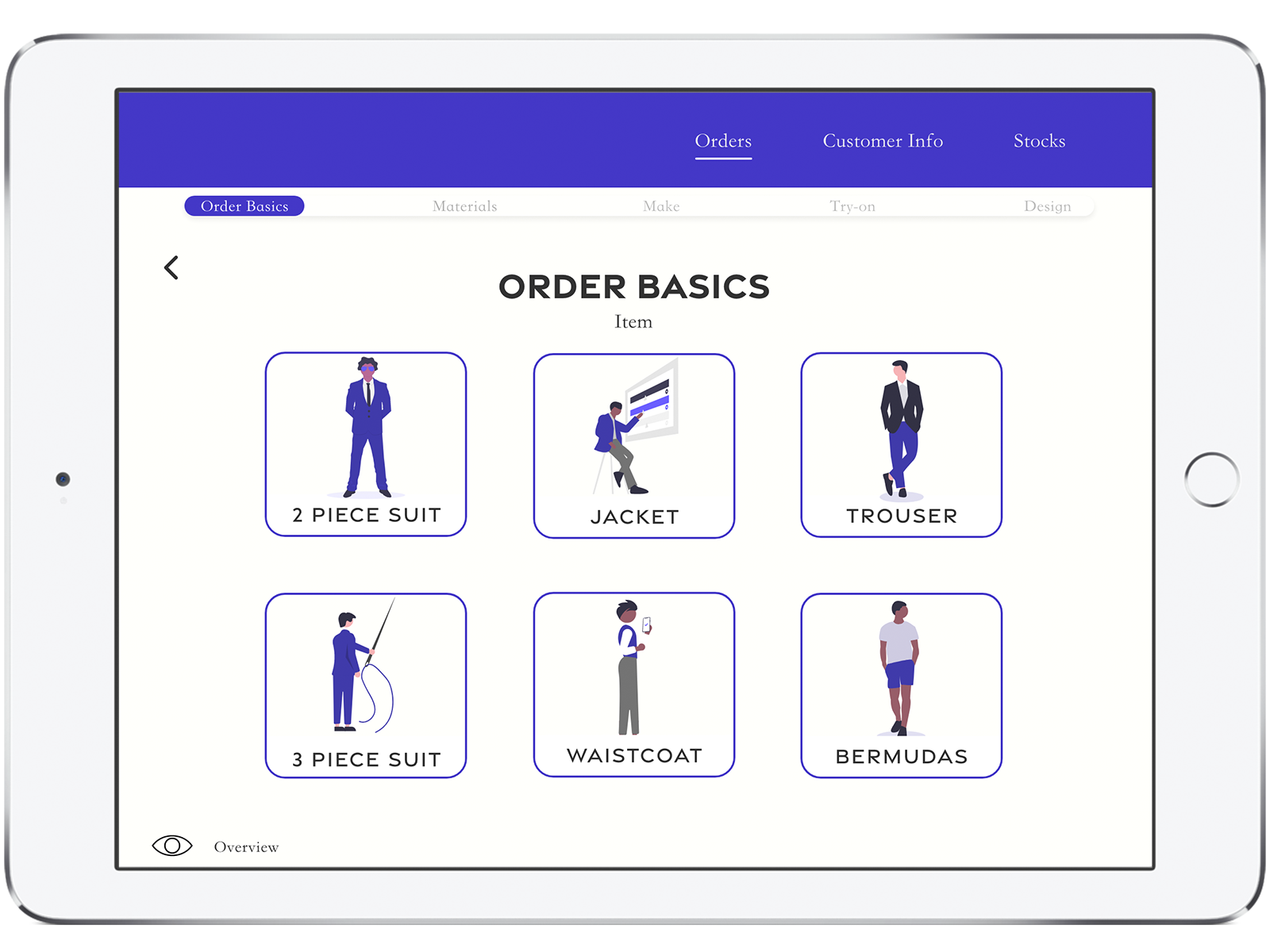
For years, Men’s fashion has been on a growth trajectory, but clothing salespeople don’t have the tools they need.

Using the existing interface to place custom clothing orders was a frustrating and cumbersome task that resulted in a negative customer experience, too.

This is a solo passion project to update that experience for salespeople.

What I learned

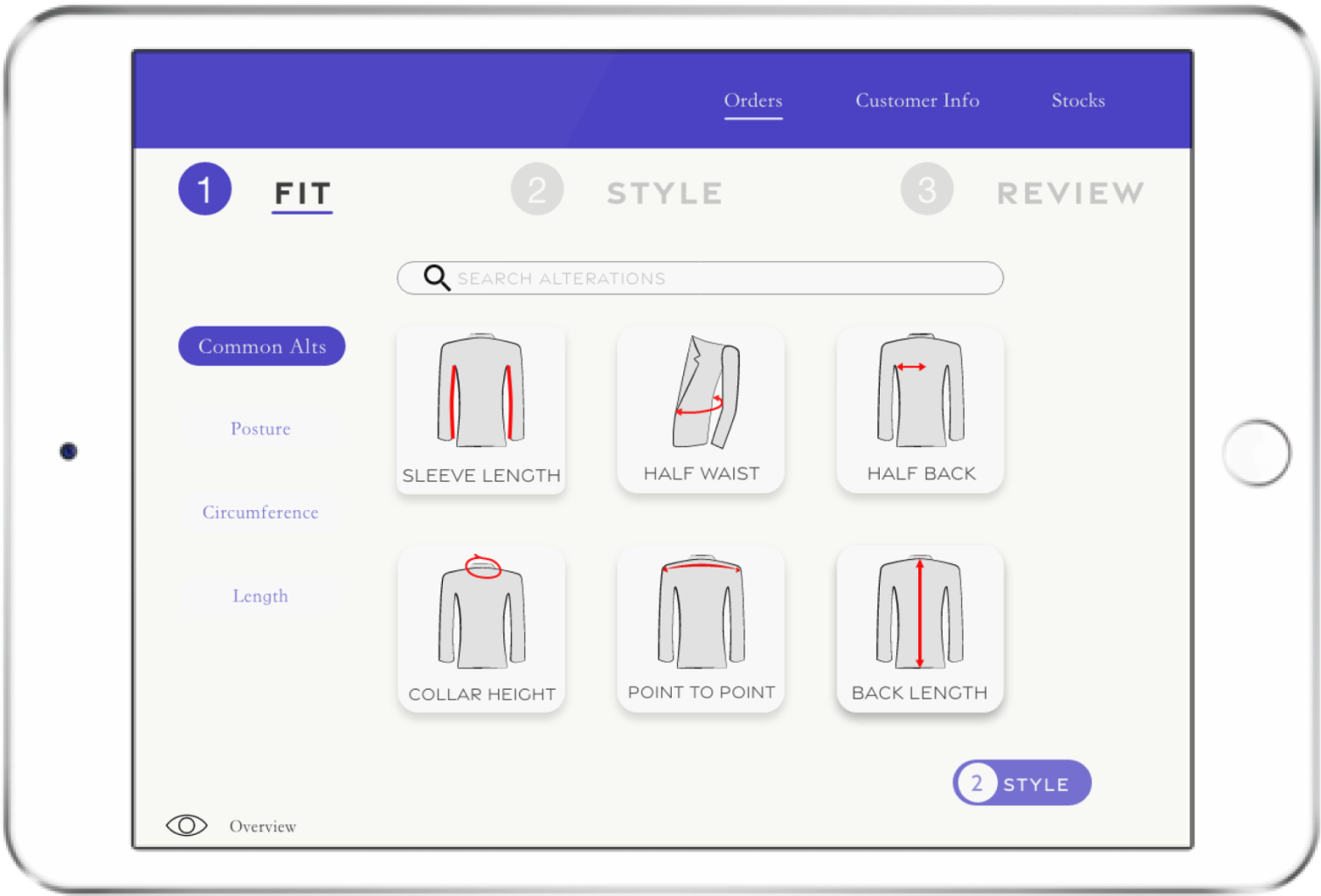
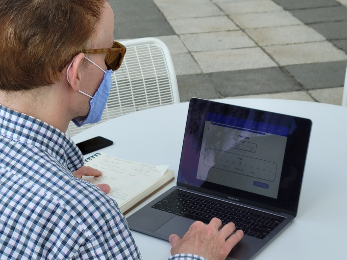
This project challenged me to pivot from designing for a desktop to an iPad: I learned that even my “failed” iterations can be resurrected in unforseen circumstances.

Brief

The Problem

Custom clothing salespeople have an antiquated order system that is cumbersome, confusing, and difficult to use. It can take as long as 90 minutes to submit a single order.

The frustrating experience detered users from making sales in the department, so the business wasn't capitalizing on its investment as anticipated.

Current User Interface

Existing Fit Tools Interface

Fit Tools Final Mockup

Redesigned Interface that caters to user needs

The Challenge

Give users an easy way to complete complex tasks quickly and accurately.

The Solution

A highly organized, graphic approach to order input, designed with speed, ease, and mobile technology in mind.

Discovery

Contextual Inquiry

I knew how these users behaved by working with them as team lead for a year. This gave me good insight to their problems and the effects on the business. But I still didn’t know their inner monologue.

User Interviews

I conducted interviews with three users to uncover their thoughts, feelings, motivations, and pain points.

Insights

Interviews taught me that users felt demotivated and stressed by the application. The excessive time it took to submit orders and the unintuitive interface felt like a punishment for making sales.

Imagine how that affected performance.

In Their Own Words

“Dumb it down a little. We’re not going to do volume with Saville Row Tailors.”

“Why is it defaulting to a peak lapel? I don’t want that.”

“Get me to the end of the order. I don’t want to think about it. This is a small part of the clothier’s picture.”

Definition

User Persona

User Persona Photo
Quentin Morrison

59, M

Occupation: Fashion Sales

Experience: 30 years

Bio

Quentin’s got an unorthodox way of doing things, but it's always worked. He has a habit of meeting prospective clients around the city and making lifelong friends as well as loyal clients. His clients love him and are eager to see him. He’s worried that mistakes might strain those relationships, though.

He's feeling left behind with the new order system and is starting to feel like all his years of experience don't mean anything. The challenging interface creates problems that cause beginner level errors.

Needs
  • More confidence in order system
  • To submit orders quickly
  • A system that reflects his experience
Goals
  • To not have to work so hard on the back end of his job
  • To focus on delivering world-class customer service
Frustrations
  • Information is not grouped logically
  • Can be difficult to get help
  • Checking, double-checking, and triple-checking take so much time.

Hypothesis

I believed that decluttering the workspace for custom clothing salespeople would allow them to take control of their process, reduce order entry time, and reduce the likelihood of errors.

Ideation

I iterated the User Flow after helpful feedback from users. My initial attempt at a user flow included fewer screens as that was one of the original pain points.

I learned that the number of screens wasn’t really the issue. Users were happy to interact with more screens if there was less to do on each and fewer opportunities for error.

Early Sketches

Interviews revealed that users need more confidence in the system before they’re willing to trust it. It became imperative to design with ease, feeback, and error prevention in mind.

I hypothesized that I could eliminate much of the confusion of the existing interface by removing the screen clutter and making the experience more visual.

A search bar style interaction would allow a user to see only the specific alterations they need for each order

A visual interaction would be very cool, but too difficult to build and also introduce opportunities for error and confusion.

Yes, another search bar, but in imagining what the results might look like, I prepared myself to solve an unforseen problem. Read on!

I tested this quick wireframe early and learned that I needed to change my approach.

Wireframe

Between the time I began the project and this wireframe, the company purchased iPads for each employee. Now, rather than going to a back office and entering orders, users were expected to enter orders on their mobile devices.

This presented a new set of problems. In addition to the challenging interface, users needed to interact with it on a device with a smaller screen (no, it wasn’t responsive), and with added disctractions to their workflow.

I needed to come up with a new solution.

Pivot

Luckily, my sketches included something that sort of looked like tappable cards, so I adapted that approach for an iPad. Now users were able to tap plus and minus icons to increase or decrease a measurement.

The most used alterations are on the first page, and users needing more obscure alteration can find them tucked away in tabs using standard industy language: Posture, Circumference, and Length.

A tappable interface with visual representations of the work to be done had more favorable test results.

Execution

Testing

Chris

Real User, Washington, D.C.

“I like that it’s super simple.”

“Your layout is much better [than the current version].”

“I want to know how quickly I can do this for a return customer. In reality most of my business is repeat customers.”

Harley

Real user, Washington, D.C.

“It takes a lot less thought and second guessing.”

“I’m way further along than I would have been with the other system.”

“The saved styles page needs work to be more clear.”

Robert

Real user, Washington, D.C. and NYC

“Oh this is easy. I wish it could be this easy.”

“The Fit Adjustments on the review page could be smaller”

“I would say the branding should be the same as the company”

Next Steps

If I were to continue work on this project today, I'd start by considering the many use cases that would take users away from this workflow.

What happens if a customer orders two jackets in the same purchase? What if there are 5 shirts that are all styled different using the same fit? What happens if a fabric is sold out?

These are all questions to be adressed in subsequent iterations so these users—and their customers can have a great experience getting custom clothing.

More Work